BOSTON -- The Penguins' meeting with the Bruins for the Winter Classic here in Boston on Monday will be the Penguins' sixth outdoor game, tying the Blackhawks for the most in NHL history. That's three Stadium Series games and three Winter Classics, including the very first one in 2008.
Earlier this week I dove into the history behind the inspiration for the Penguins' jerseys this year, and it's really a cool story.
Where do the jerseys for this year's Winter Classic rank among the Penguins' past outdoor jerseys? Here's a look back at those past looks, and how I'd order them.
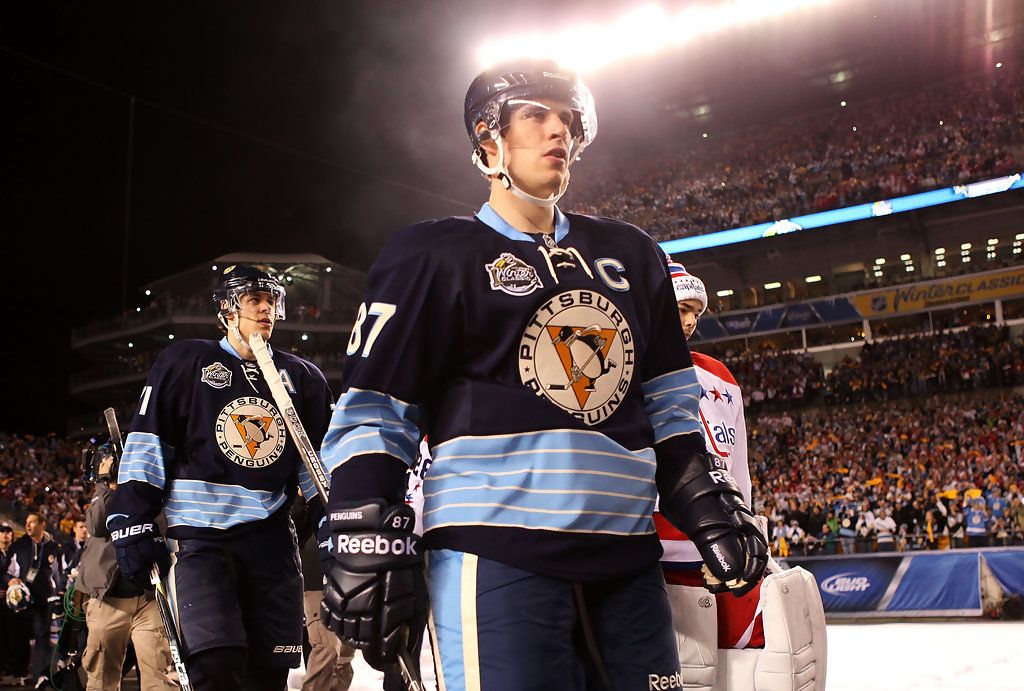
6. 2011 WINTER CLASSIC
Jan. 1, 2011 - Heinz Field
GETTY
I don't really get these. Back when the Penguins wore blue originally, they only had navy as the primary color for three seasons, it was always a lighter blue. The only other throwback-inspired thing about these is the logo. Meanwhile, the Capitals' jersey for this game was almost a dead-on copy of their original uniforms. I just don't know what these were supposed to be. They were really modern-looking with a really old-looking logo slapped on the front. The three-dimensional number patches are neat, I'll give them that.
Style aside, these would rank dead last regardless because they were clearly cursed. When these later became the third jerseys, the team actually stopped wearing them mid-season before they were scheduled to do so because players kept suffering major injuries in them. The first was obviously Sidney Crosby's concussion in the actual Winter Classic with these jerseys. Other notable injuries in these jerseys include a concussion to Evgeni Malkin, and the final injury in these jerseys, Crosby's broken jaw.
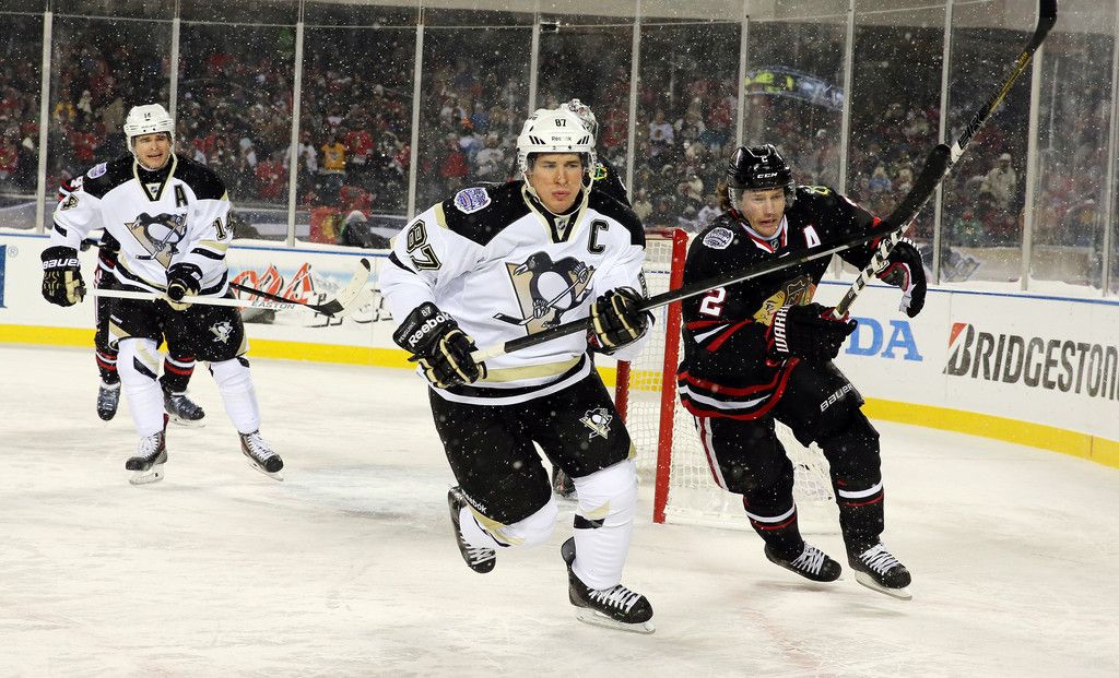
5. 2014 STADIUM SERIES
March 1, 2014 - Chicago
GETTY
In fairness to the Penguins, the weird chrome design here was just the NHL's theme for the Stadium Series games that year, not anything they chose. Either way, I think it's just awkward-looking. Something feels off about the blocking on the shoulder, and the stripes around the sleeve end halfway around as if they ran out of fabric. Same with the stripes on the socks, they just awkwardly stop. It just looks like a weird version of their away jerseys at the time. The only reason these aren't last is because nobody suffered a career-altering injury in them.
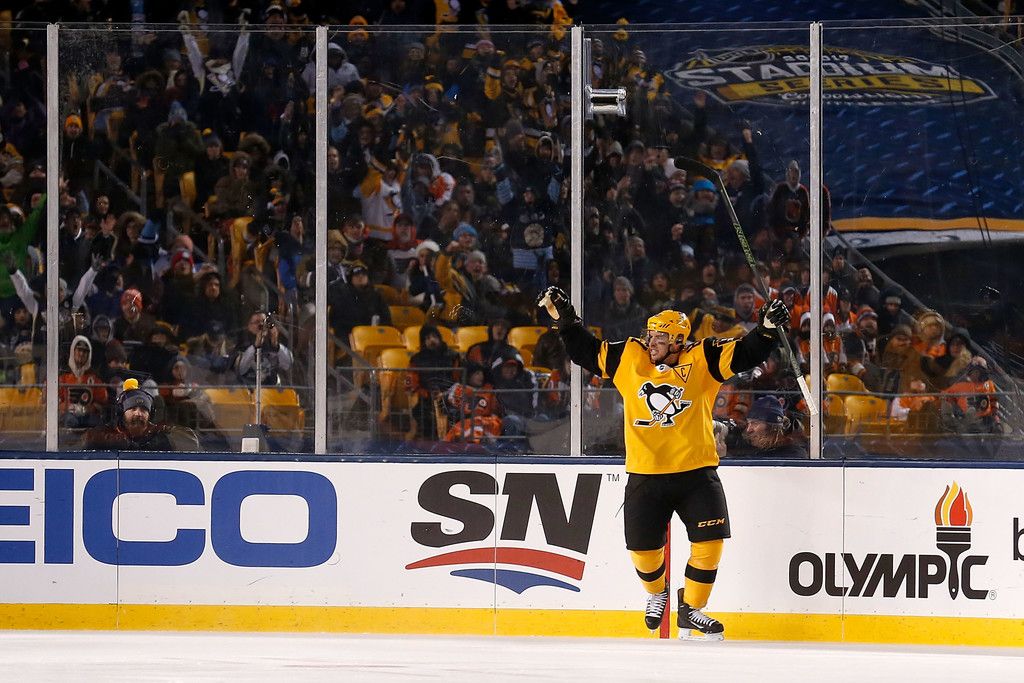
4. 2017 STADIUM SERIES
Feb. 25, 2017 - Heinz Field
GETTY
These were pretty good. I liked the City of Champions patch on the shoulder and the cool font used for the names and numbers. My only real complaint is that the logo on the front doesn't have the triangle behind it so it looks a little empty. These had the triangle around the 'C' or 'A' patches, for some reason. Overall, not a bad jersey. My enduring memory of this game is that Ron Hainsey made his Penguins debut in it, so an historic moment took place in this jersey.
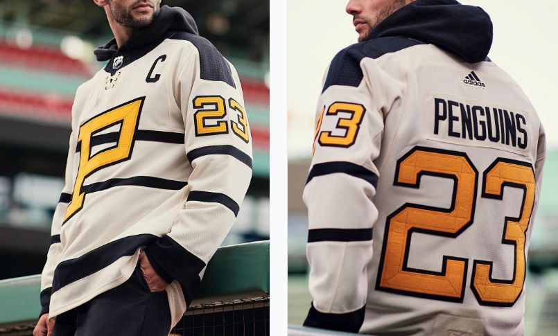
3. 2023 WINTER CLASSIC
Jan. 2, 2023 - Boston
ADIDAS
Even without knowing inspiration for these and the story behind Pittsburgh's original NHL team, the Pirates, these are just cool jerseys. They're clean, simple, and the cream color and stitching on the numbers really give it a vintage look, more so than any of the Penguins' other Winter Classic jerseys.
I think these would have been cooler if they just went with a look even closer to the original Pirates jerseys. Those were more of a mustard color and had a script "PIRATES" above the "P," it would have been cool if the Penguins did that with their own name. The script lives on in these uniforms, it's just on the pants. The original Pirates jerseys also had patches for the city crest on the shoulders that were actually borrowed from old city police uniforms.
2. 2019 STADIUM SERIES
Feb. 23, 2019 - Philadelphia

GETTY
I didn't really like these at the time, but the simple color scheme ended up being cool. The small details on these were nice, like "A GREAT DAY FOR HOCKEY" being on the inner neckline as a tribute to Bob Johnson, and the keystone logo on the pants. These also had sick helmets, with the logo taking up the entire left side of the helmet instead of being a small sticker.
1. 2008 WINTER CLASSIC
Jan. 1, 2008 - Buffalo, N.Y.
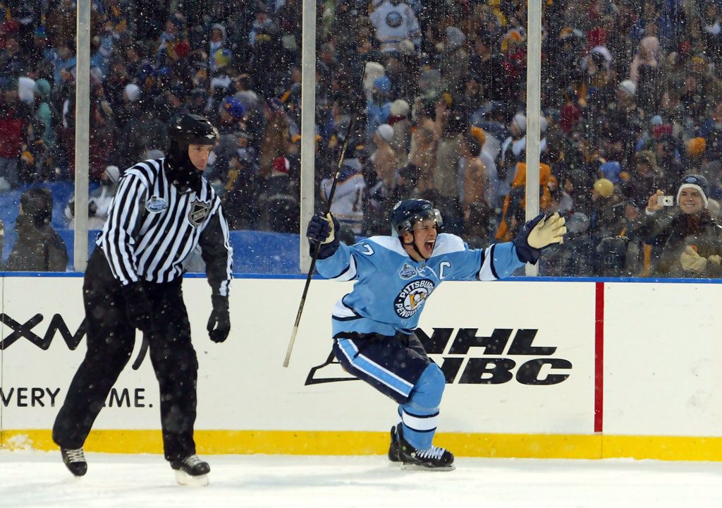
GETTY
There's a reason that the Penguins kept these as their alternate jerseys through the 2010-11 season, and it's just because they're the best. They're a pretty exact copy of the Penguins' dark jerseys worn from 1968-71, laces and all. They have that old-school feel but didn't look out of place in today's NHL, either. You can't look at these without remembering Crosby's shootout goal to win the first Winter Classic as the snow fell down around him. 10/10, no notes.
