The Penguins have had a number of very different jersey designs and color schemes in their history.
The logo on the front has gone through several evolutions, from the diagonal "Pittsburgh" to the penguin in the circle, the skating penguin, the triangle pigeon, and now back to the skating penguin, with the color scheme changing from various shades of blue to Pittsburgh gold and Vegas gold.
Which looks have been the best? Here are my top five picks, listed in reverse order.
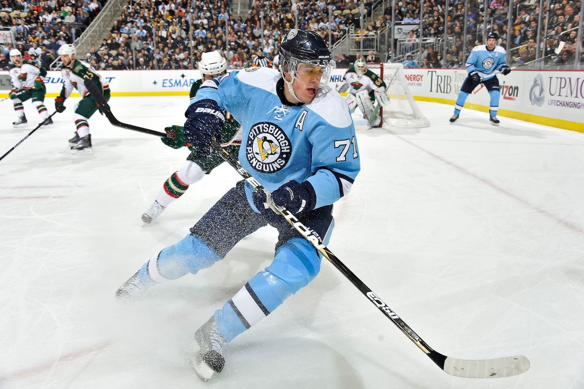
5. 2008 WINTER CLASSIC
GETTY
Evgeni Malkin
I loved these as a way to bring back the baby blue color scheme of the franchise's early years. I think this jersey also gets a few points because you can't help but look at these and remember Sidney Crosby's game-winning shootout goal as the snow fell in the NHL's first Winter Classic game, back when the outdoor games were still a novelty. A cool jersey worn in some great moments.
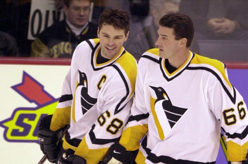
4. LIGHT UNIFORM, 1992-02
GETTY
Jaromir Jagr, Mario Lemieux
The triangle pigeon logo gets a bad rep, but I just love how clean this look is. It wasn't around for any Stanley Cup runs, but it's still associated with some pretty big moments. The two that stand out (not including the fight scene in "Sudden Death") are Mario Lemieux's last home game before his first retirement, and then his later return:
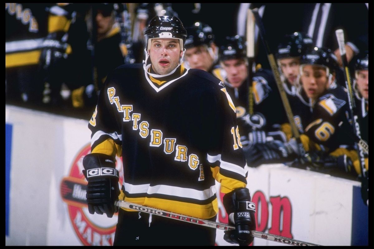
3. DARK UNIFORM, 1992-97
GETTY
Francois Leroux
These are the Penguins' inaugural season jerseys with an updated color scheme, and the inspiration for the "reverse retro" jerseys for the current season. I know they're controversial for how similar they are to the jerseys of the Rangers, who apparently invented the concept of diagonal letters.
I know Kris Letang has mentioned several times in recent years that this is the jersey he wants the Penguins to bring back the most.
For some people, this jersey is best remembered as the jersey from Snoop Dogg's "Gin and Juice" music video:
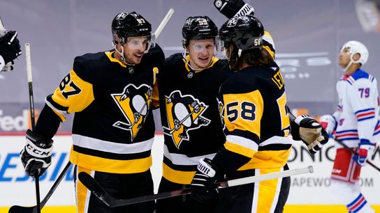
2. HOME UNIFORM, 2016-PRESENT
GETTY
Sidney Crosby, Jake Guentzel, Kris Letang
The Penguins wore a similar style from 1980-92, then brought these back as an alternate jersey from 2014-16 before switching back to it as their full-time home look. It was the style that the Penguins were wearing when they lifted their first two Stanley Cups, and now it gets to be worn by the current core as well.
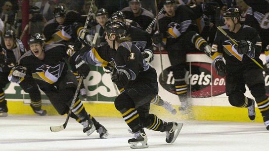
1. DARK UNIFORM, 1997-02
GETTY
Penguins players celebrate Darius Kasparaitis' overtime goal.
The Penguins first wore these as alternates from 1995-97 before making them a regular jersey, and I just think they're great and a perfect example of some of the crazy looks worn by teams in the late 90s and early 2000s. You just don't see gradient like this anymore. It'll always have ties to the Lemieux-Jaromir Jagr era, but its most iconic moment has to be the Darius Kasparaitis overtime goal against Buffalo and ensuing celebration.
YOUR TURN: Which jerseys would be in your top five, and are there any jerseys that the Penguins haven't already brought back that you'd like to see return as a third jersey?
